I was contacted by Pasibus, the tastiest burger restaurant chain in Poland to do a project that turned out to be one of my favorites.
Normally, clients contact me with a more or less defined brief — especially since I mostly work on UX/UI design. This time, the brief I was given was something like this:
“Jarek, our brand design is inconsistent, our brand guidelines are inconsistent, and the output of our designers is also inconsistent. We like our identity and we don’t want to rebrand. We just need it to stop being a mess and we don’t know how.
”So it was rather an open-ended question than a requirement — what should we do?
So I started by going to the Pasibus HQ to meet with the design and marketing team to see how they work and what they need to make it better and more consistent. I found out that their team produces an astonishing amount of social media posts, restaurant menu boards, print materials for restaurants, outdoor advertising etc. The only main design guideline the team had was an old-school, 10-page PDF brand book and a general, commonly understood sense of brand DNA and good taste.
As a UX/UI designer, I am pretty much spoiled by great tools and tech (especially Figma) that make my life easier. At this point, I take all those for granted, such as real-time cloud collaboration, file version history, global component libraries, commenting systems, easy-to-use layer styles, etc. So it was quite a flashback for me when I saw a huge folder on a shared local network drive full of PSDs named ‘Campaign Poster final5”, a subfolder called “aaaBrandbook” to keep it on top or a few duplicated instances of the same resources, placed in different subfolders.

Needless to say, for a team that needed to produce a crazy amount of consistent resources, the amount of guidance, and the toolkit used were not helpful.
For the team to achieve better results, we needed 3 things: a system, a tool, and a guide.
The System
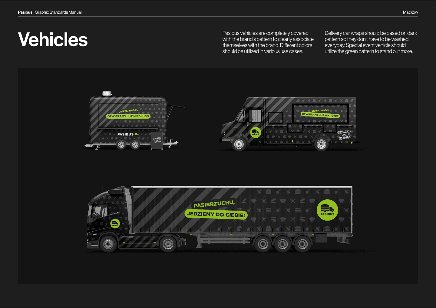
For a company with a decent amount of sub-brands, campaigns, and different design applications, the amount of guidance the designers had was definitely not enough. The brand book prepared for Pasibus a while ago was a typical, small document showing color codes, logotype safe areas, font styles and an infographic explaining, that you can’t stretch and skew the logo.
It was pretty clear that we needed more. So long story short — we came up with consistent rules for using patterns, colors, graphic design elements, simple and complex typography, decorating company cars, and so on. No need to explain it in detail, so I am just putting a few slides here showing some of the many pages of explainers, guides and specs prepared.


The Tool
If all the cool features that make Designers’ life easier in Figma work for UX/UI — shouldn’t they also work here? All the problems I saw in the current process seemed solvable.
Complex file structure with no source of truth -> teams, projects and component libraries
Stakeholders can’t see the designs until a meeting -> real-time preview available via URL
File versions set between designers -> cloud collaboration
So after a few pitches and presentations — we decided to move almost all, everyday design work to Figma. The only things we left the old way were the most complex print works — like preparing car wraps, burger box cut-outs etc.
I started preparing the file structure and moving all the critical, reusable assets to Figma. Apart from the regular stuff like patterns, logos or illustrations, the most used assets in a burger chain’s designs are obviously burgers.
Pasibus had a pretty vast menu containing tens of burgers in different sizes, drinks, fries, cheese balls and many more. To make all the food photography consistent and easy to use, we decided to do a new photoshoot and put all the packshots in the design system too. So we locked ourselves in a studio for a week and photographed every Pasibus menu item.
Definitely one of the tastiest photoshoots I directed.
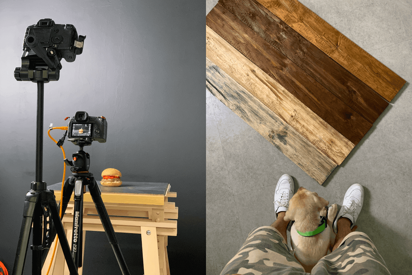
With the power of Figma components and variants, I was able to create a “scene creator” made of photos of food, drinks, wooden table tops, backgrounds, and accessories. So now, creating scenes including different meals — which previously was one of the most time-consuming things to do for designers — could be done in literally minutes.


With all the assets, styles and packshots placed in one master design library, I started preparing child files and templates for different design types. Social media posts, display ads, menu boards — we needed it all. Again, Figma turned out to be a pretty good solution for this. 10 separate files for different display ads resolutions? Nope, just one master component and child components using responsive layouts. Pretty nice.
Figma design library was set up and ready to use. Now we needed to teach designers how to take the new design system and start using it consistently.
The Guide
I never had a great experience with PDF brand guides. They are hard to edit, so they were almost never updated. If they were — it was difficult to keep track of different file versions and distribute it across the team members. It also mentioned a lot of things like illustrations, logotypes, or patterns, but never told you where to find them.
So it turned out it wasn’t only my experience and there is already a bunch of solutions on the market solving this. We went with Brandpad, because it seemed super simple, well-designed and easy to use.
So I took all the new design rules and put together a huge, comprehensive guide on Brandpad. It allowed us to upload downloadable assets, link to Figma files related to particular sections, or use simple navigation, scrolling the guide to the appropriate section.
So now anytime a new designer joined, this simple URL became their onboarding bible.
I know that more modern, interactive brand guides are not something entirely new - but I love how easy it is nowadays. I did a really similar guide a few years ago and to achieve the same result we needed to set up a separate Wordpress website.
This whole project was finished sometime last year. Since then, the design team switched to Figma almost completely and everyone seems pretty happy about it — designers, managers, stakeholders (or at least they told me so). Now, the design system is managed completely in-house. Designers at Pasibus are doing a great job at adding new packshots, templates and assets and putting them to use.
Although this whole project was about using modern design software and technologies to streamline processes, I still love some of the old-school approaches. I was always very passionate about modernist design and Massimo Vignelli’s work. One of the things that inspired me about what he did were the brand manuals. Those massive binders with really detailed specs are something truly magical to me. And I really love what Standards Manual is doing at bringing some of them back to life.
This is why, after the project was finished, I prepared a Vignelli-inspired, print version of the Pasibus Brand Guide, and put it together into this beautiful, green binder box.


The biggest takeaway of this project for me was — the great, streamlined design environment that was built mostly for UX/UI design works perfectly for graphic design too, without many changes in software and processes.